Tuesday, December 30, 2014

A look at the gold complex:


In order to technically claim a plot – such a gold - has a positive trend change we need a few conditions

First we need a recognized down trend which is a series of lower highs and lower lows. Then we eventually get a rally from a higher low – but the rally needs to break above the prior lower high (the pivot) in order to confirm a positive trend change. If this occurs on a daily chart we get a trade. On a weekly chart the pivot is higher – but you have to start somewhere. The attached chart tells all – a down trend, a higher low and a pivot target


Friday, December 26, 2014

December and Seasonality


The only thing I know about seasonality is during an uptrend you buy low – sell high and then buy back even higher. In a downtrend you sell high - buy low and then sell even lower.

December more than any other month is loaded with seasonality folklore which is recycled annually in the business dailies. The books on seasonality are published every season and basically say the same thing as last season. The seasonality bible is the Stock Trader’s Almanac first published in 1967. This book allowed Mr. Hirsch to distil his lifelong interest in stock market history, cycles and patterns into a practical working tool for the average investor. It was the first compilation of the market’s seasonal trends and tendencies combined with a calendar and laid out for use by non-institutional investors.

One of the mid December seasonal plays is the “free lunch” wherein investors tend to get rid of their losing stocks near year-end for tax purposes. This often has the effect of driving the prices down to near 52-week lows. The Stock Trader's Almanac has shown that NYSE stocks selling at their lows on December 15 will usually outperform the markets through the following late January and early February. I assume the TSX would follow the same model.

Next is the Santa Clause rally which is a short advance within the last 6-days of December and into the first 2-days of January. The Almanac quote is “If Santa Claus should fail to call, Bears may come to Broad and Wall.”

Then we have the January Barometer which states that as January goes, so goes the year. The 2010 Almanac claims only 5 errors since 1950 for a 91% accuracy ratio.

Finally we have the January Effect which is the tendency of the small caps to out-perform the large caps through January as measured from the Russell 2000 vs. the Russell 1000 index. The Almanac post several reasons for this seasonal event.

I will likely post the same thing next year


Wednesday, December 17, 2014

The Talisman mercy killing:


A clip from BNN - The TSX ended more than 1 percent higher on Tuesday boosted by a 46 percent surge in Talisman Energy shares after Repsol said it would pay $13 billion for the producer; and - according to the business media the CEO of long-struggling Talisman Energy Inc. (TSX:TLM) says a multibillion-dollar takeover by Spanish energy giant Repsol is the best possible outcome for shareholders and he expects the deal will receive federal approval. To recap - Talisman Energy Inc. (TLM) closed Dec 16 at $ 8.84 up 2.87 for a one day gain of 48.07%.

That reminds me of a business headline in the Calgary Herald – September 21, 2012 (I kept the paper) “Nexen CEO excited by deal,” referring to the July takeover offer by the Chinese CNOOC - the stock popped about 50 percent on the news. Those lucky shareholders! The reality is that long term investors actually lost money on both deals. In the case of Nexen the post deal close of about $17 was actually lower than he mid 2006 prices. In fact the only winners were the Nexen buyers of the lows of 2008 and 2011. In the case of Talisman the only shareholders who made money were the buyers during the recent eight week collapse beginning in October 2014. There could be more exciting times ahead for long term energy investors

Thursday, December 11, 2014

Tesla and the bearish rising wedge:


According to Investopedia; “a rising wedge is a bearish pattern that signals that the security is likely to head in a downward direction. The trendlines of this pattern converge, with both trendlines slanted in an upward direction. As the price moves towards the apex of the pattern, momentum is weakening. A move below the lower support would be viewed by traders as a reversal in the upward trend.”

In other words – in a normal up trend one could place two parallel trend lines bounding the rising highs and lows and create a rising price channel. But aggressive selling into each rally sets up a series of weaker highs which causes the upper trend line to tilt down toward the lower trend line to create a wedge. Some famous bearish rising wedges were INTEL March – September 2000 and the US$ index October 2000 – January 2002

Here we see Tesla Motors Inc (TSLA) falling down out of a large rising wedge – not as big as the First Solar (FSLR) wedge but still a worry. 


Wednesday, December 10, 2014

They all loved Crescent Point Energy:


Many “experts” quoted on stockchase.com still love Crescent Point Energy Corp. (CPG) - over the past two months they ranked the stock to be a hold (4), a top pick (2), a buy (9) and only 2 don’t buys. So now at mid day at $22.43 CPG is down 10% and the yield has soared to 11%. One of the recent comments of an expert (a few weeks ago at $35) says “He is quite optimistic on the energy space in general, but you always need to be picking good quality companies. Forgetting about the dividend, he likes this company’s growth profile”. Just to refresh - last July the price peak was about $47 and at the time just about all of the experts loved Crescent Point with “buys” dominating the last July – August window.

So here is the root of the problem - when “experts” get on business media – most talk their book. In other words few ever disclose what they intend to buy – or intend to sell – they just disclose what they own. So when they all own and love Crescent Point – who is left to buy?

Wednesday, December 3, 2014

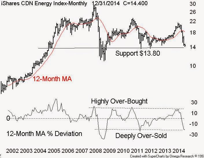
TSX Energy sector is technically over-sold:


Sometimes a bearish stampede out of a group of stocks can push prices down to an extreme distance below short and long term moving averages – such as the 50 and 200 day simple moving average (MA). I call this study a %D or percent deviation.

The Canadian energy complex as represented by the iShares S&P/TSX Capped Energy Index ETF (XEG) is deeply over-sold as measured by the per cent price drop from the long term mean as measured by the simple 200-day (or 40-week) moving average.

When studied on a monthly plot we get a bigger picture and I calculate the %D based on a 12-month simple MA. Note the lower plot on our long term monthly energy plot with the % Deviation line – now down to levels not seen since September 2011 and January 2009. It is reasonable to expect a recovery bounce at least back to the mean - the 12-month MA – currently $18.24 - over the next several weeks. The first upside price target should be at least back to the very short 50-day ma currently about $16.60.


Tuesday, November 25, 2014

A gold stock relative buy signal:


In an earlier post I looked at Fibonacci ratio studies as applied to gold and the gold miners – and - what you can expect when a market begins a corrective phase. The classic Fibonacci retracement percent number (%R) is 61.8% but 50% and 100% (not Fibonacci #’s) are common. A long term chart displayed gold and the gold miners rebound from the 2008 financial crisis lows to the 2011 price peaks and the subsequent correction expressed as per cent retracements.

Now I present a relative perform study - daily with the gold miners above the gold bullion ETF setting out some relative perform buy and sell signals as displayed in the lower short term spread. The calculation is the upper plot / lower plot with a 20 period smoothing. One caveat with relative studies – a relative out perform sector can still go down – but at a slower rate than the related sector – its all relative.

Monday, November 17, 2014

Energy – the long term picture:


Canadian investors – for some reason – are attracted to energy stocks – much like moths to a fire. The reality is the broader sector as measured by the S&P/TSX Capped Energy Index has delivered a price return of zero since 2005.

Many technical analysts are applying various studies to the crude problem but when in doubt I always first go to a very long term chart and seek out a primary trend line.

Our 1996 – 2014 monthly crude plot displays the 5-wave 1998 – 2008 advance that ended with the great July 2008 price spike. The subsequent 6-month collapse was followed by a rebound bull that peaked in April 2011. From there crude traced out a long 3-year symmetrical triangle that ended with crude breaking down to the current $75 level – which happens to be right on a very long term primary trend line. A failure here would have crude testing the lower support levels of $72, $51 and finally $38. I think the bottom is in at $72 support. This would be confirmed by a peak in the SPDR Consumer Discretionary ETF (XLY) – which is a beneficiary of lower crude prices.

Alert! Just before posting I was told that Dennis Gartman, the author of The Gartman Letter, during a BNN interview – predicted crude to fall to $50. That should be good news for the energy bulls because of Gartman’s track record as displayed by the Horizons AlphaPro Gartman ETF (HAG) which was “to provide investors with the opportunity for capital appreciation through exposure to the investment strategies of The Gartman Letter” The fund was shut down (shuttered) in March 2013.


Wednesday, November 12, 2014

BNN and the Health Sciences Selections:


Last night on BNN’s Market Call I stated that the current bull market in most of the major stock indices is now well into the fifth year – or about 2035 days. The average length of modern bulls (5 since 1974) is about 2460 days (thanks Ned Davis) – so the current bull is quite old in terms of time. So - we are likely in the early stages of a topping phase which could take several months to complete. Some the early technical signals are the gradual thinning of market breadth as seen in the cumulative NYSE advance / decline line and the cumulative NYSE new 52-week Hi /Lo line

All tops are different and I suspect this one will see money – over the next several months - chase the smaller speculative sectors which as jr. metal miners (uranium & copper) and the smaller biotech / health sciences stocks. I promised to post a list of TSX listed bio & health stocks with a caveat – they are risky – some will be big winners and some will be big losers – so buy a small basket – do your homework and better still get advice from an industry professional. Also BNN in no way support or recommend these names – the opinions are mine only. The last time I created a basket of bio & health stocks was August 2013   the big winner was Tekmira Pharmaceuticals Corp TKM  up 293.2% and the big loser was Acasti Pharma Inc. APO down -74.0%

PS – other names – not displayed - with strong money flow numbers are Cardiome (COM), CRH Medical (CRH) and Microbix (MBX)

Tuesday, November 4, 2014

Gold vs. the gold miners:


According to Elliottwave International Elliott waves often correct in terms of Fibonacci ratios. They explain in their new eBook How You Can Use Fibonacci to Improve Your Trading, which explains what you can expect when a market begins a corrective phase.  The classic Fibonacci retracement percent number (%R) is 61.8% but 50% and 100% (not Fibonacci #’s) are common.

Basically a retracement is a correction that follows a meaningful advance as illustrated in our chart – monthly data displaying gold and the gold miners’ rebound from the 2008 financial crisis lows to the 2011 price peaks and the subsequent correction expressed as per cent retracements. The bearish 2011 – 2014 stampede away from the gold miners has been extreme as measured by the collapse back to the October 2008 lows – back when we had $700 gold prices. The question here is that who is wrong – the gold miner bears (a bearish stampede) or the gold bulls who have not capitulated. Yesterday I observed many candlestick bullish reversals on the gold miners.

Next post: Crude vs. the energy producers.


Tuesday, October 28, 2014

North American Technology – stealth leadership:


We at Getting Technical use the long term (monthly data) and intermediate term (weekly data) sector momentum tables to track the rotation of various stock sectors. Often a sector will display strength on the monthly tables and conversely display weakness on the weekly tables - a condition that can mute the longer term trend. The ideal condition is for a sector to display strength – or a high rank on both the monthly and weekly tables. Currently the technology sector is printing a high rank in both the weekly and monthly Canadian and U.S. sector momentum tables.

In Canada the go-to proxy for the technology sector is the iShares S&P/TSX Capped Information Technology Index ETF (XIT) which replicates the performance of the S&P/TSX Capped Information Technology Index, net of expenses. The index is comprised of constituents of the S&P/TSX Composite Index in GICS Sector 45 – and the constituents are capped at a 25% weight.    

The top five holdings by weight are: CGI Group Inc (GIB/A) 24.64%, Open Text Corporation (OTC) 19.78%, Blackberry Ltd (BB) 15.04%, Constellation Software Inc (CSU) 15.00% and DH Corp (DH) 7.21% to total almost 82% of the sector by weight. A technical study on one component – Blackberry (TSX-BB) suggests the downside may be limited based on long term monthly data – and the two large triangles – the bearish descending triangle of 2008 – 2011 and the current possible reversal symmetrical triangle. Note the money flow numbers suggest exhaustion on the buy and the sell side.


Wednesday, October 22, 2014

At the Toronto World MoneyShow:


I presented at the Toronto World MoneyShow on October 18, 2014 and explained how I used technical analysis to select at least 5 takeover candidates during my time as a sub-advisor to the Union Securities Hybrid program. For a copy just post a blog comment or contact me at info@gettingtechnical.com

I took questions on the fly and several centered on my views of the recent global sell-off in the equity markets – I was prepared and proceeded to display several crisis-related graphic – front page - headlines displayed by the financial press.

The first was a cartoon of and upside down bull (Barron’ s October 19, 1987. The second was a list of “Canada’s hottest dot-coms” (Globe Report on Business June 22, 2000. The third was a cartoon of several great US financial giants being swallowed by a giant black hole, “A Day Of Reckoning” (Globe Report on Business September 16, 2008). The fourth was a full page one-day dive of the Dow Industrials, “Worst one-day fall etc.” (Globe Report on Business August 5, 2011 and finally a full page graph of the TSX Comp and the TSX Energy sector crashing, “FORTY-DAY FREEFALL”, (Globe Report on Business October 15, 2014). In each example these huge banners were published very near to important troughs or peaks, - a great contrarian indicator.

At least the Globe is creative, a Toronto Star item - Monday, October 20, 2014 just rehashed an old correction classic “Why this market correction is no cause for panic:” The author advises the readers to, “turn off the TV. Ignore the noise” and that the best companies pay dividends“- advice from an author with no financial accreditation.

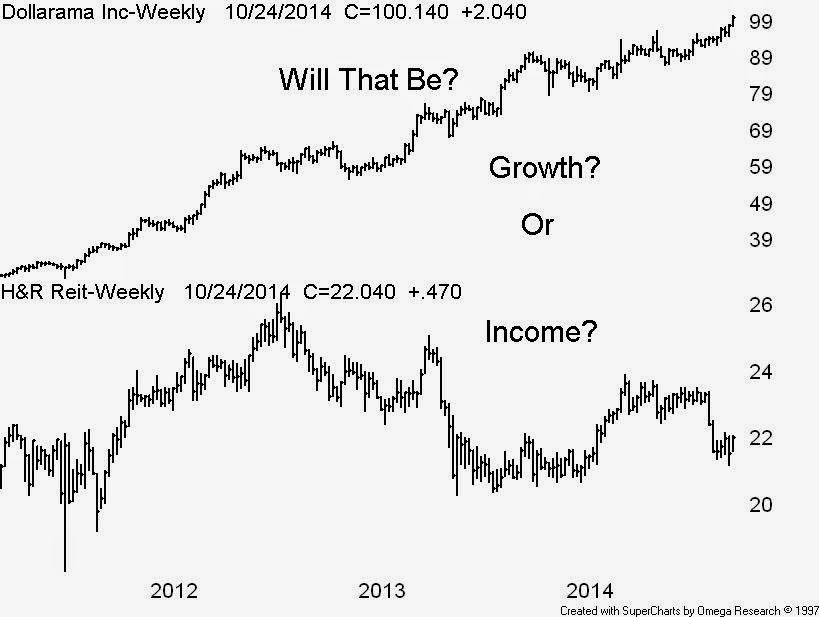
Well, some of the “best companies” had big declines from their recent 2014 price peaks, Bank of Nova Scotia -15%, BCE Inc -10%, CDN Natural Resource -29%, CNR -16%, Enbridge -18% and TransCanada – 22% - I could go on. The chart today displays a low yield growth company plotted above a big dividend payer – and how about those dividend paying Dow components - Coca-Cola Co. (KO), McDonald’s Corp (MCD) and the late great IBM – all big dividend payers and share buy-back losers


Friday, October 17, 2014

Some bullish signals from the US financials:


I have learned that (thanks to the great Ian Notley) – no bull market can operate without the leadership – or participation from the financial sector of stocks. This rule would apply to most of the mature global equity markets.

Now according to Sector SPDRs the SPDR Select Sector Financial (XLF) is a wide array of diversified financial service firms are featured in this sector with business lines ranging from investment management to commercial and investment banking. Among the companies included in the Index are JPMorgan Chase, Wells Fargo, and BankAmerica Corp. Currently the top weight is Berkshire Hathaway B (BRK.b) at 9.0% followed by the usual suspect banks and then Goldman Sachs Group Inc, (GS) at 2.6%.

Note the chart displaying Berkshire – weekly above Goldman – weekly plotted with their respective 10  & 40 week simple moving averages – clearly both still trading above a rising 40 week (or 200 day M/A) – so there is no break in these bellwethers. By the way both lead us out of the 2008 financial crisis with the Berkshire bottom in Feb 20, 2009 and the Goldman bottom in November 21, 2008 


Monday, October 13, 2014

Time to watch the Russell 2000:


Just the repeat once again on market breadth “The Advance / Decline Line (AD line) is one of the most widely used indicators to measure the breadth of a stock market advance or decline. The AD line tracks the net difference between advancing and declining issues. It is usually compared to a market average where divergence from that average would be an early indication of a possible trend reversal.”

They say a picture is worth a thousand words.  

Our latest NYSE advance / decline line displays a break down below the pivot – the early August lows. The problem now is the S&P500 has just confirmed the A/D line break by also breaking below the early August lows

Now the pain is close to the end as the Russell 2000 (the first the break down) currently at about 1049 - is only 50 points above major support as viewed by a point & figure.


Saturday, October 4, 2014

Market breadth – Still No Breakdown:


Just the repeat once again on market breadth “The Advance / Decline Line (AD line) is one of the most widely used indicators to measure the breadth of a stock market advance or decline. The AD line tracks the net difference between advancing and declining issues. It is usually compared to a market average where divergence from that average would be an early indication of a possible trend reversal.”

The last time we looked – the breadth problem was acute as we needed the A/D line to hold at the early August lows to complete a shallow A-B-C type correction. Now as displayed in the latest chart as of the Friday Oct 3, 2014 close, we can see both the S&P500 and the NYSE Advance / Decline line holding just above the respective early August lows. So far we have just a rolling sector rotational correction as the energy & materials trade inversely to the consumer, financial and health care sectors. Most notable is the Dow Transports bouncing back above the short 50 day M/A which is well above the longer 200 day M/A


Wednesday, October 1, 2014

Canadian Energy stocks and the big myth:


The big Canadian energy names, are they great long term investments? Well the experts seem to love them – go to stockshase.com and you will find the CNQ lovers – and I quote, “His favourite.  Superbly run, Thinks the market is really ignoring that this company gets a lot of their effective pricing from Western Canada Select, This, along with Suncor (SU-T) are probably the 2 premier energy stocks. Has done well this year, Cheap and generates cash flow. Pays a nice dividend. If this is in your TFSA and you are looking out a few years, this is a fine place to be, and - A very dominant producer in the western Canada space. International operations in the North Sea and West Africa. Extremely well managed.”

As for the Suncor lovers, and I quote, “With oil by rail, maybe Keystone does not matter.  They are a refiner with upstream and downstream operations.  This is a very conservative company.  They had very good dividend increases.  Worth buying here, Growth in cash flow over the next number of years is tremendous.  Suncor (SU-T) or Canadian Natural Resources (CNQ-T) for the growth? These are both excellent choices, His model price is $79, an upside of 81%. He is willing to be patient and wait for the value to be created. – and Likes it.  Even though he thinks oil prices are vulnerable, SU looks attractive in the long term.”

The quotes are out of context but the message is clear. The very long term charts display several years of no capital returns – both are components of the S&P/TSX60 index and among the worst performers of the index since their relative 2006 – 2007 price peaks. If you’re looking for growth such as we have in consumer, health care, industrial, financial and the technology sectors don’t look to the big energy names anytime soon – for traders only. Don’t get me started on Crescent Point


Monday, September 22, 2014

Market breadth – Even More Worry Now:


Just the repeat once again on market breadth “The Advance / Decline Line (AD line) is one of the most widely used indicators to measure the breadth of a stock market advance or decline. The AD line tracks the net difference between advancing and declining issues. It is usually compared to a market average where divergence from that average would be an early indication of a possible trend reversal.”

The last time we looked – a few days ago with the S&P500 at all time highs - the NYSE A/D was still not confirming the recent advance - a sign of thinning leadership. Now on Friday the Standard & Poor’s 500 Index fell from a record, while small-cap shares sank and Alibaba Group Holding Ltd. rallied in its debut. Commodities declined to a five-year low and the U.S. dollar advanced pushing Gold to an eight-month low, while silver hit the cheapest level in four years.

The breadth problem is still acute as displayed in our latest NYSE A/D line chart. Now we see the S&P500 (last Friday) at an all-time high and the lower A/D Line failing to break above their respective July 2014 highs – it is still to early to call a breakdown – but we need the A/D line to hold at the early August lows to complete a shallow A-B-C type correction.

Sunday, September 14, 2014

Market breadth – Some Worry Now:


Just the repeat once again on market breadth “The Advance / Decline Line (AD line) is one of the most widely used indicators to measure the breadth of a stock market advance or decline. The AD line tracks the net difference between advancing and declining issues. It is usually compared to a market average where divergence from that average would be an early indication of a possible trend reversal.”

The last time we looked – back in August 18 the S&P500 was at all time highs and the NYSE A/D was still not confirming the recent advance - a sign of thinning leadership. Now the breadth problem is acute as displayed in our latest NYSE A/D line chart. Now we see both the S&P500 and the lower A/D Line failing to break above their respective July 2014 highs – so now we need the A/D line to hold at the early August lows to complete a shallow A-B-C type correction


Thursday, September 4, 2014

The problem with gold:


Investors and traders in the gold complex are running out of patience in reaction to the slump in the sector following an early summer rally. Nothing is working be it seasonal, Russia or the so-called extended global equity markets.

I think our dollar/gold chart pinpoints the real problem – the strong U.S. dollar which has been the go-to place – well since early summer. As we can see the price relationship is somewhat inverse – dollar up – gold down and vice-versa as displayed by the lower US$ vs. gold study. The big disappointment for gold investors was due to the early summer advance in spite of the dollar advance – this appeared to be a set-up for a dollar peak which did not occur. Let us see if the US Dollar index trades back up to the 84 level – or the $23 level on the UUP – and then look for the gold complex to rally.


Friday, August 29, 2014

The 100-yr Dow & the Next Big Thing


Secular trend Rules

A secular up trend will contain at least 5 bull and bear cycles and usually will introduce “The Next Big Thing” or the Dominant Theme, which will persist for 20+ years and eventually end with an asset bubble or a crisis.

A secular down trend will contain at least 3 bull and bear cycles one of which will be a Granddaddy Bear. The Granddaddy will be the largest bear in the series in terms of duration and magnitude. It is usually the 1st or 2nd bear and is typically introduced by a Crisis which in turn will kill the current “Big Thing”

Some past Asset Bubbles and Modern Crises

The first automotive boom of 1909 through 1927, the Nifty Fifty buy-and-hold bubble of the late 1960’s, the second automotive boom of 1946 to the Arab Oil Embargo of 1973-1974, the Dot Com technology bubble late 1990’s and the U.S. Housing Bubble of 2005 – 2007 and the Subprime Lehman Brothers crisis of September 2008.

Note the recent break of the Dow up and out of the 2000-2013 secular bear – likely driven by a new Dominant Theme – any suggestions?


Monday, August 18, 2014

Market breadth – a big test coming:


I think the last time I looked at the NYSE advance / decline line was back on December 24th, 2013 when I tabled this description - “The Advance / Decline Line (AD line) is one of the most widely used indicators to measure the breadth of a stock market advance or decline. The AD line tracks the net difference between advancing and declining issues. It is usually compared to a market average where divergence from that average would be an early indication of a possible trend reversal.”

At that time the S&P500 was at all time highs and the NYSE A/D was still not confirming the recent advance - a sign of thinning leadership. Subsequently we got a shallow correction in late January 2014 and in mid February the A/D line broke to new highs and in May the S&P500 followed and broke to new highs. Now here we are - once again - with both the S&P and the A/D line rebounding from a late July swoon and running back up to the early July highs. This will be an important test because we need both to break to new highs in order to continue the 2014 advance.


Tuesday, August 5, 2014

A P&F Breakdown on Valeant (2):


A quick update on health care component - Valeant Pharmaceuticals International, Inc which happens to be listed on both the Toronto and New York stock exchanges. A duel listing is a positive if US investors love you but, not so nice if US investors change their minds – which seems to be underway – right now.

On the prior post TSX listed Valeant  plotted on a point & figure (thanks to Stockcharts.com) – we saw the potential breakdown of support at the $126 range or about $116 in US dollars. I suggested if VRX trades down to $114 (US) the longs should take the money and run. Today – thanks to Stockcharts.com - on a P&F we can see the breakdown in the NYSE listed Valeant – with broken support at $114. The next lower support is now at the $104 level – with the next target being that lower primary trend line.


Thursday, July 31, 2014

A P&F Breakdown on Valeant Pharma:


One of the best charting tools is the Point & Figure – there are several reasons to never ignore a P&F signal - one being unlike the popular MACD, its use is not widespread. What advantage is there in seeing a MACD signal when MILLIONS of traders and investors see the same thing at the same time?

Our chart today is health care component TSX listed Valeant Pharmaceuticals International, Inc. (VRX)  plotted on a point & figure (thanks to Stockcharts.com) – where we can see the potential breakdown of support at the $126 range or about $116 in US dollars. I would suggest if VRX trades down to $114 (US) the longs should take the money and run.


Monday, July 28, 2014

What are the shorts thinking?


Once again we look for a potential “Short Squeeze” opportunity which is a situation in which a heavily shorted stock or commodity moves sharply higher, forcing more short sellers to close out their short positions and adding to the upward pressure on the stock – etc, but also to see if there is a contrarian opportunity.

At July 15, 2014 I looked at the top 20 stocks with the greatest short sale increase over the past 2-week period. There were 5 energy stocks, 6 financial stocks and 6 material stocks – the rest were industrial and health care. So materials are the most popular short sale sector – the unpopular Teck Resources Ltd (TCK.B) was on the list

Our chart today is materials component Teck Resources daily plotted with two moving averages and money flow numbers plotted on a momentum histogram – with all paining a bullish picture. Another study – not shown – is Teck plotted above the broader TSX60 index clearly displaying a positive relative perform vs. the TSX60 Index. Yes there could be a contrarian opportunity here.


Monday, July 21, 2014

Secular Trends Reviewed


Last week I attended the Canadian Society of Technical Analysts annual meeting in Toronto (CSTA) who had Mr. Ray Hanson, who has not spoken publicly to the Society in over 10 years, as a keynote speaker – topic – “The Secret Life of Spreadsheets.” I attended to see if Hanson would make a long-tern prediction on the capital markets.
Hanson was the guy who – in about 1987 - took over the original RBC Capital Markets (RBC) respected Trend & Cycle Department that was created by the team of cycle legend Ian S. Notley and Donald R. Stark – who were famous for their long-term predictions.

I still have a number of their (Notley & Stark) brilliant 1980 through 1984 Trend & Cycle publications which I still review to-day. Their great top down calls ranging from calling the bond market “the buy of a generation” to predicting the re-structuring of the huge American multinationals and the early transition from the “old” economy to the “new” economy are the stuff from which legends are created.
.
I think it is the goal of most technical analysts to go out on a limb and – like Notley – make one correct long term forecast that may impact generations of investors and money managers – so I reviewed my presentation at the CSTA Annual Meeting in Toronto June 24, 2009 “Secular Trends in Stocks and Stock Sectors” just to see if I was on track to making a relevant long term forecast.

There I defined a Secular Trend to be A long term trend (12 to 20 years) that contains a series of bull and bear cycles – hence the term “Secular Trend” - a secular up trend will contain at least 5 bull and bear cycles – and - a secular down trend will contain at least 3 bull and bear cycles. I went on to detail the current 2000- 2009 secular down to be a Global Event with low Sector Correlation and two sector Granddaddy Bears (technology 2000 – 2002 and financial 2007- 2008) with a Probable Rotational Conclusion

One of several original charts was displayed – see the clip of Amazon and Taiwan Semi dated month end June 30. 2009 clearly setting out a final and third final cycle in their secular bears – I was predicting a break from here out and up to new highs. Other names displayed were Cisco, Texas Inst and the biotechnology index.  


The next chart is clip of Amazon and Taiwan Semi dated to-day and as we can see both have broken up and out of their secular bears – I have left the original support / resistance lines in place. Other names – among many - breaking out of their secular bears are INTEL Honeywell and Microsoft.

Almost forgot – a clip from the Hanson presentation, “Gross National Product is the official index to assess prosperity – but GNP measures only activity. It measures neither prosperity nor well-being.” – Well, you had to be there.


Thursday, July 17, 2014

Gold – Long Term Analysis:


Below is a clip from a recent Getting Technical Market Letter Interim Update July 10, 2014 GT1440 – a technical look at bullion using about 15 years of monthly data.

Gold – The Long Term - The price of bullion remains in a long term up trend as displayed by our 15-year monthly chart - See chart - The long 2011 through 2013 A-B-C type correction is now complete – having found support at the long term primary trend line. The new bull would be confirmed on a monthly close above 1400

There was a Caveat::

We need the BMO Junior Gold Index ETF (ZJG) – upper chart -to trade above $9.50 and we need the iShares S&P/TSX Global Gold Index ETF (XGD) – lower plot - to trade above $13.50 to confirm their respective bulls